A responsive mobile-first app that offers anyone, anywhere access to affordable expert consultations in virtually any field.My role: UX Research UX/UI Design
Tools: Figma - Adobe (PS-AI-ID) - UsabilityHub
Duration: 8 months
Problems OH, problems
Our users need access to qualified experts to solve their questions/issues instantly because they feel that a lot of time, stress, and money can be wasted looking for the right answer.
Project Overview
As a result of COVID-19, our daily lives were drastically disrupted, affecting how we worked, studied, visited doctors, celebrated holidays, worked out, talked to family, and accessed experts.Video communication then started to play a major and meaningful role and became to us what is today the "new normal".
Expert OnDuty was created to enable people to have access to expert advice in virtually any field instantly, no matter where or when and with the possibility to pay per minute making it affordable and accessible for all.
*I completed this project as part of my UX immersion course at Career Foundry.
Hell YEAH, Solutions
All together now
Intended to create one platform, where users can access experts instantly in ANY field via video call or chat, paying by the minute or consultation, making it affordable and accessible to all.
Options give me some optionsWith searching for expert feature possibilities, the user can find the right expertise by typing a keyword or expertise and selecting one from a list or can type a detailed description of the issue with the option to add an image and wait to be contacted by experts that are capable to help.
Be the OnDutyPossibility to become an expert and work any time, anywhere setting your own fees by helping others to solve their questions.
So,WHAT’S the challenge?
Understand the attitudes of potential users when requesting an expert’s opinion. What do they do? Does the person call someone, do they search the web for answers, do they schedule an appointment?
Understand what my users needs are when searching for expert advice. Time, cost, efficiency, etc.
Understand the contexts in which users would contact an expert for advice through an app.
The Design thinking process
Empathize
I identified my target audience by,researching, and conducting competitive analysis
As a way to understand my users' needs, I conducted interviews and surveys to develop personas.
In this stage, I created task flows, sitemaps, and wireframes as the ideas started to take shape.
Validated designs through usability and preference tests, created a high-fidelity prototype with UI elements.
Marketing Research
Surveys & Interviews
Affinity Maps
User Persona
Users Journeys
User Flows
Card Sorting
Site Map
Wireframes
Usability Tests
High-Fi prototype
UI elements
Marketing Research
Based on competitive analysis and user research, I evaluated products that would likely run into direct competition and identified which similar products users are using and who my target audience will be.
To define my Research goals, I asked myself: What do I need to know about my users? This led me to write a list:
Understand the attitudes of potential users when requesting an expert’s opinion. What do they do? Does the person call someone, do they search the web for answers, do they schedule an appointment?
Understand what my users like/dislike in the search process for expert advice. Time, cost, efficiency, etc.
Understand how the user experiences similar products and why they enjoy them or not.
Understand the contexts in which users would contact an expert for advice through an app.
Surveys & Interviews
As a result of gathering information about the current market and audience, it was possible for me to start digging deeper and gain insight into their experience with accessing expert's advice through video-call
My first step was to conduct an online survey with 11 questions. I posted it on several platforms and received 54 responses.
By conducting this survey, I identified users' expectations and habits when seeking advice from an expert. After gathering the survey results and In order to gain a deeper understanding of users' desires and needs, I interviewed 3 people.
Affinity Map
Insight & Needs
The ability to acquire services quickly (if possible, instantly). Being able to save money.
An easy but secure way to pay for a service without paying transaction fees.
Self-managing appointments online.
Options on how to communicate with an expert (chat, video call, not only over the phone).
Continually learning new things (self-actualization).
Autonomy: The ability to solve problems on their own.
Assurance: a way to verify the expertise of experts.
A way to filter experts (Skills proficiency, Ratings, language spoken, availability, location).
Having the ability to contact experts quickly in an emergency.
Ability to become experts when they are ready and confident.
An easy-to-use platform with a clean interface.
User Personas
Based on the research and data collected from user interviews and the survey, I developed user personas. I enjoyed this step a lot since It helped me empathize with and visualize end users and experts.
In total, I created 2 personas for users and 1 for experts each with their own needs and motivations for using the app.
User Journeys
As a way to empathize with Dallas, Miguel, and Ana I created User Journeys to get a sense of their day-to-day activities.
As shown in the scenario below, Dallas encounters a WordPress problem at work. Her consultant is on vacation, and she needs immediate assistance and has not been able to find an answer on the web
User Flows
To understand my users’ points of view, I created a user flow with this I was able to identify which screens would be needed for each step that my user would take.
Card Sorting
Using the information gathered to date, I began generating potential solutions. My first step was to create a sitemap, which was then evaluated by conducting a digital close card sorting test. The card sort was sent to 13 participants, with 9 of them completing it. They were asked to organize 13 cards into three categories already predefined in order to validate them
Sitemap
I followed a strict hierarchy structure for my initial sitemap. However, after reviewing the analysis and taking into consideration the results of the matrix I reorganized the sitemap for the app. In this change, subtopics are repeated in two or more categories so the user can easily access them from anywhere.
Wireframes
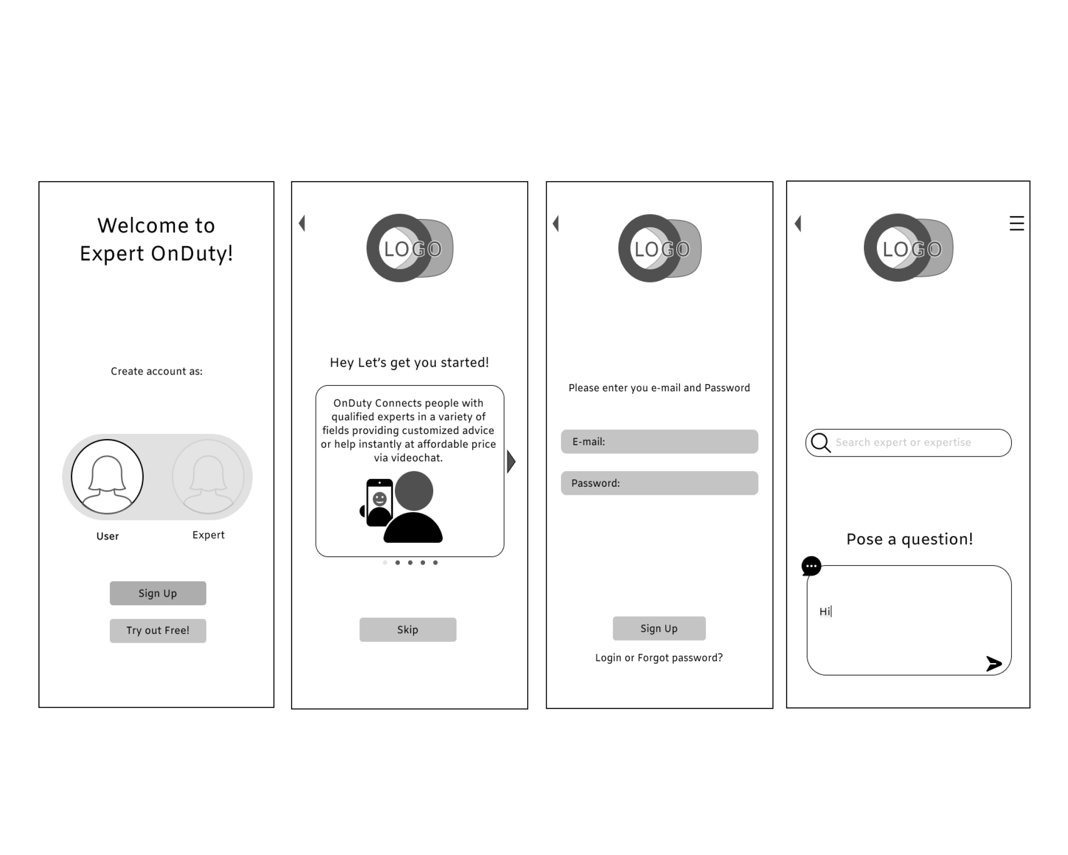
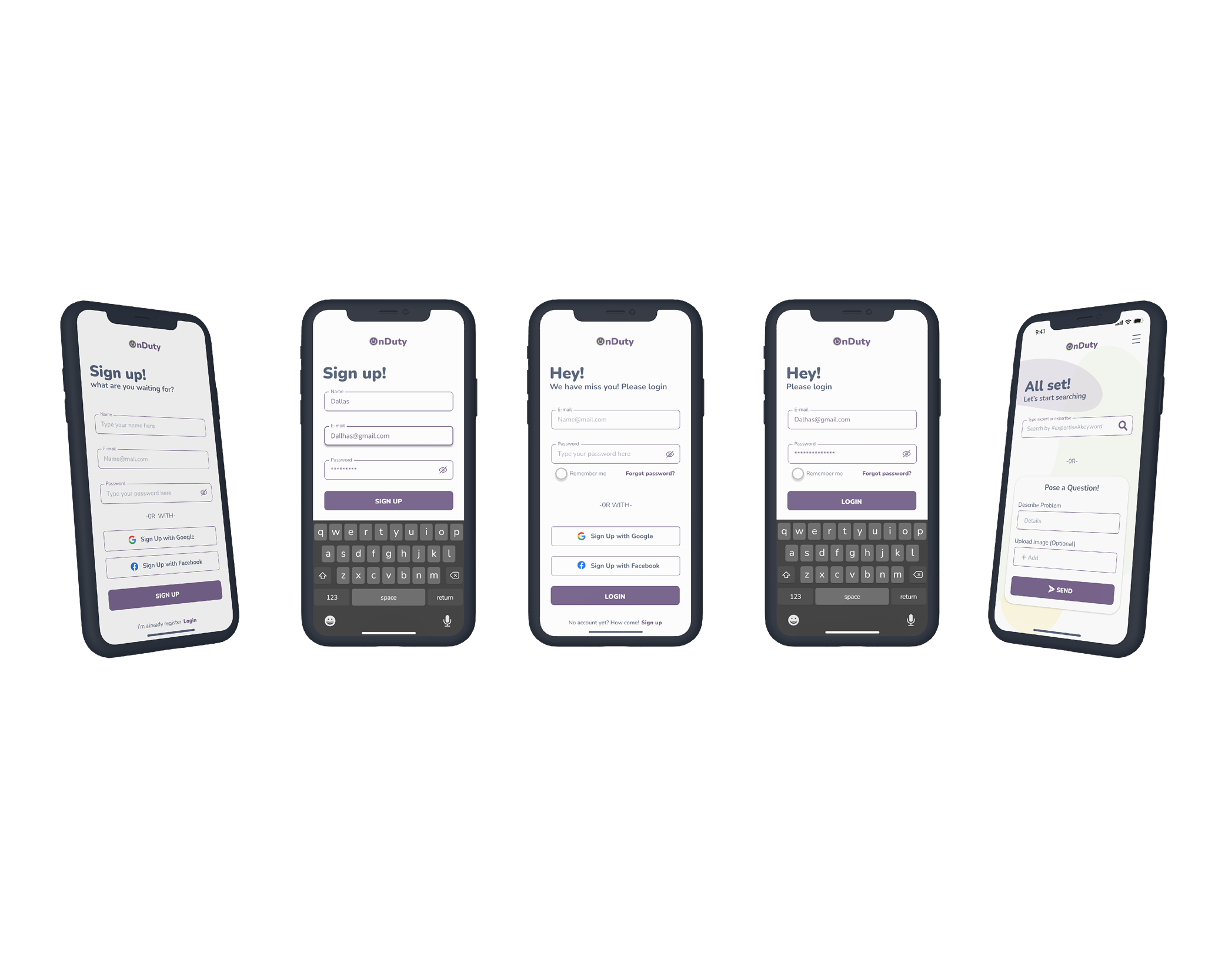
I started off sketching low-fidelity wireframes with paper and a pen several sketches of the same page, and eventually switched to Illustrator and Figma for sketching a mid-fidelity interactive prototype and I did a first user test. Then I did a high-fidelity interactive prototype that had all of the necessary features to reach the MVP and tested it again.
Lo-Fi (On boarding screens)
.
Mid-Fi (On boarding screens)
.
High -Fi (On boarding screens)
.
Usability Test
A moderated in-person test was conducted using 3 participants; each participant used their own cellphone. To capture non-verbal language and document the sessions, I recorded them. Each participant was given three tasks and then asked questions about their impressions and thoughts after using the prototype for the first time.
GOALS
Assess whether users understood the app navigation and if they were able to accomplish the basic functions such as creating an account and going through the onboarding process.
TEST OBJECTIVES
Observe if the process of accomplishing the tasks was intuitive and straightforward.
See if participants utilized the feature of selecting several experts to ask a question.
Identify if they found useful both options for searching for an expert
TASKS
Sign up with google.
Search for an expert
A way to pose a question
Video call an expert.
Review the call and rate the expert.
Fill up an account.
Test Results
With all the data collected, I created an affinity map and a rainbow spreadsheet that helped me identify all the areas that need improvement. My portfolio contains this information. In the usability test, many pain points were discovered that needed to be addressed. Due to time constraints, I selected 5 of them to adjust.
Some changes after testing and feedback
Issue 1
Issue 2
The next step was to conduct A/B preference testing on some of my screens, such as the OnBoarding screens, Signup/Login screens, and search screens.to validate my assumptions and further refined my design.
Iterations, ITERATIONS, Iterations
I then added more visual elements to the wireframes and all the UI elements to create a complete Design Language System. Finally shared my design with my peers on Slack for more feedback. Afterward, I iterated until a high-fidelity functional prototype was reached.
Define
Ideate
Prototype & Test
My final prototype was created after I made all the high-fidelity wireframes and screens and after I ensured all of the requirements and features described in the brief were met.
Rainbow spreedsheet
https://docs.google.com/spreadsheets/d/1RpmsJsGoM5V6RWw1Miofb_QcX7QBHSP5sfTCorlV8XA/edit?usp=sharing
Final Prototype
I had a very enjoyable time creating this full case study from start to finish. All of the goals outlined in the brief were achieved during the course of the project. Based on users' interviews and testing, I added and removed features, which was a very valuable learning experience! I would like to continue developing this case study by adding the expert side to it!


